
Designing and testing the new exercise auto-detection feature
The Challenge
I was tasked with turning a new algorithm into a new feature, and integrating it into an already crowded user interface, while making the feature’s value obvious to users at first glance.
Goals
To develop a coherent and compelling design while prototyping a "Lean UX" model of working new to Fitbit
Impact
The feature was ultimately rolled out to all users; my rapid prototyping and research helped the design team hit the ground running after I returned to grad school, saving them time validating and understanding user preferences.
My role
I was the UX designer, UX researcher, and product manager for this new feature
Timeline
Eight weeks
Auto-detection of users' workouts was something that Fitbit had been hoping to incorporate for a long time. Previously, if Fitbit users wanted to log workouts, they had to manually enter them into their Fitbit’s calendar. After my colleague Hao-Wei Hsu wrote an algorithm to detect periods of running and walking based off step data, I designed and tested a version of the feature for Fitbit's web dashboard. With the help of Victoria Li, an intern on the web team, we were able to iteratively test a prototype with our participants' actual data.
In a few weeks, the experience went from a paper print out of this:

to a web prototype like this:

The Research: Lean iteration and testing
While adding an activity auto-detecting algorithm to Fitbit's web dashboard sounds interesting, I knew it would require a lot of iteration and user testing in order to figure out exactly how to incorporate the feature.
There were three things I wanted to learn from my research with users:
How do people conceive of this feature?
How do people prefer to have the data visualized?
How could the feature be altered in order to make it more useful?
(Altering the feature by renaming it or presenting it slightly differently from its original concept could go a long way toward preventing misconceptions at the user's first glance.)
Interviews and user tests with think-aloud protocols at different levels of fidelity helped me answer the questions.
During this phase, I learned a lot from working with the engineer who wrote the algorithm. I had to serve as an ambassador for user research, so that the technical R&D colleagues could understand why it might take several weeks to decide how and where to insert this feature into Fitbit's existing customer experience.
The existing product environment: challenges
Part of the philosophy behind adding an activity auto-detection feature was to help Fitbit users track workouts more easily. Instead of manually logging activities, users could rely on the algorithm to record their runs, power-walks, hikes, etc. Naturally, many questions arise:
How long or intense of a walk or run counts as a "workout"?
Could users designate that they want runs recorded in their workout history, but not walks? How would that work?
How do people want to receive the data: as a new dashboard tile? Or should the feature be integrated into an existing dashboard module, such as the daily steps graph, the weekly recap, or the Recent Exercise module? (The developer team strongly recommended against the creation a new dashboard module, because of the effort involved on the web team's part.)

Fitbit's existing web dash, before the incorporation of the auto-detect algorithm.
Research Phase 1
Before our first research session, I hypothesized that users would only like to see long walks and runs pointed out on the graph. After all, a 10-minute walk from the office to Starbucks isn't a "workout"—or so I thought.
An artifact from our first research session. Hao-Wei, the data scientist, set the algorithm's threshold so that any walk or run longer than five minutes would be highlighted, with walks in light purple and runs in blue. We hoped to test the accuracy of the algorithm as well as user reactions to the feature.
I dropped Hao Wei's Python charts displaying each research participant's step count data into a screenshot of the existing Activity bar chart page, and then printed out copies for each of our ten participants.
What we found was that users really liked seeing all the activity called out on the graph, even "tiny" walks and runs. The users liked trying to think back on what occasioned the walks that were picked up by the algorithm. I went back to the drawing board, trying to come up with a way to support the users' desire for context (e.g., "this is a lunch walk," "this is a commute walk from the train station to the office," "this is a walk home from the bar to my apartment").
Many of my colleagues in the design department thought that this provisional interface would fall flat because it doesn't allow an option for users to delete or edit an auto-generated walk or run record. However, in the research sessions, none of the participants saw the utility in such a feature.
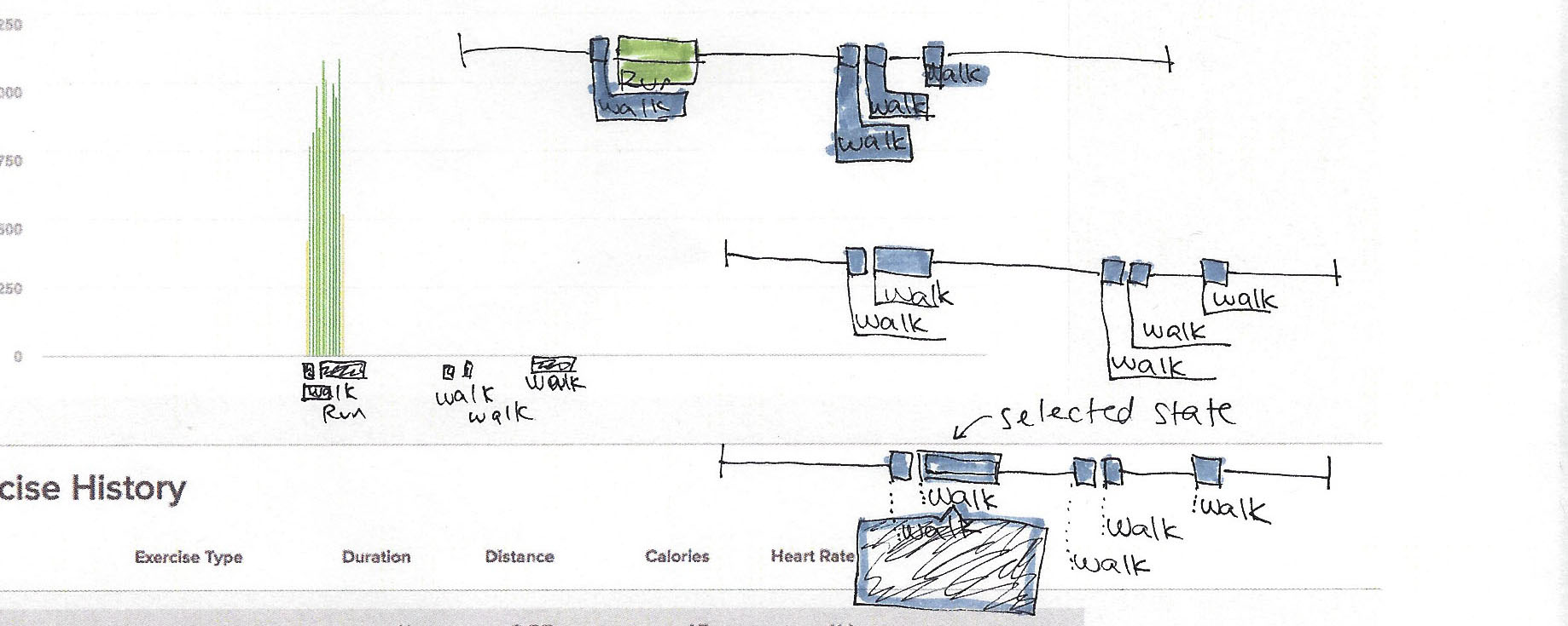
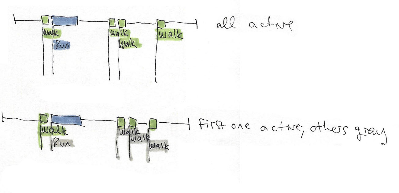
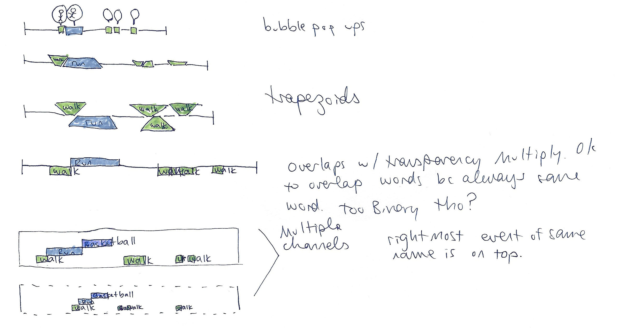
Ideation: Data visualization & research phase 2
Before my next round of user testing, I experimented with several interaction patterns and data visualizations.
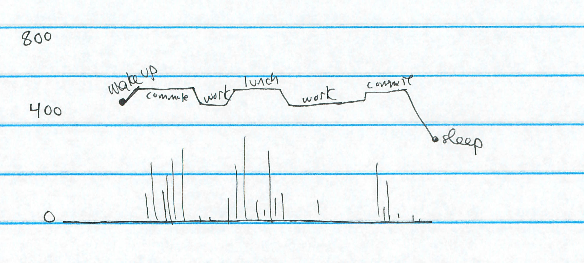
While the developer worked on an API endpoint to connect our digital prototype to Fitbit's real back-end databases of user data, I continued to test with paper prototypes. I printed out mockups with the participants' actual data, in order to make the tests as realistic as possible. Testing details of the interactions with the web interface on paper was hard!
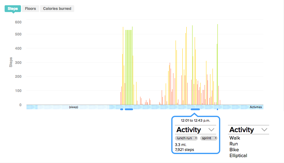
Above, you can see the addition of "tags," which I thought users might like to use to add context to the auto-detected events. As you can see, the algorithm came up against a difficult challenge in the form of elliptical machines. Since the algorithm couldn't distinguish step activity from elliptical sessions, many users' elliptical workouts were erroneously counted as runs or walks.
Research Phase 3: Digital prototyping
The developer and I settled into a workflow based off the Lean UX model, whereby I would give her a mockup at the beginning of the week which she would build for user tests later in the week. In the meantime, I would work on the next design iteration.
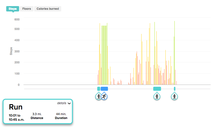
We tested a new prototype with 19 users, some of whom had participated in previous rounds, and some of whom were new to the project. The digital prototype looked like this:
I thought the two-track separation of walks from runs was an elegant way to display the two types of information, but the participants almost unanimously shot it down. Several pointed out that they'll never be walking and running at the same time.
Despite previous interviews that led us to believe that users weren't so detail-oriented about their daily activities, we also found out that users wanted precise information: start time, stop time, duration, and distance, for instance.
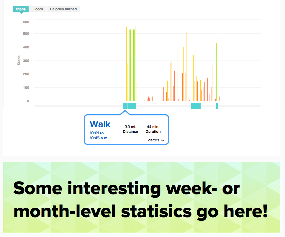
Meanwhile, I explored the data visualization some more:
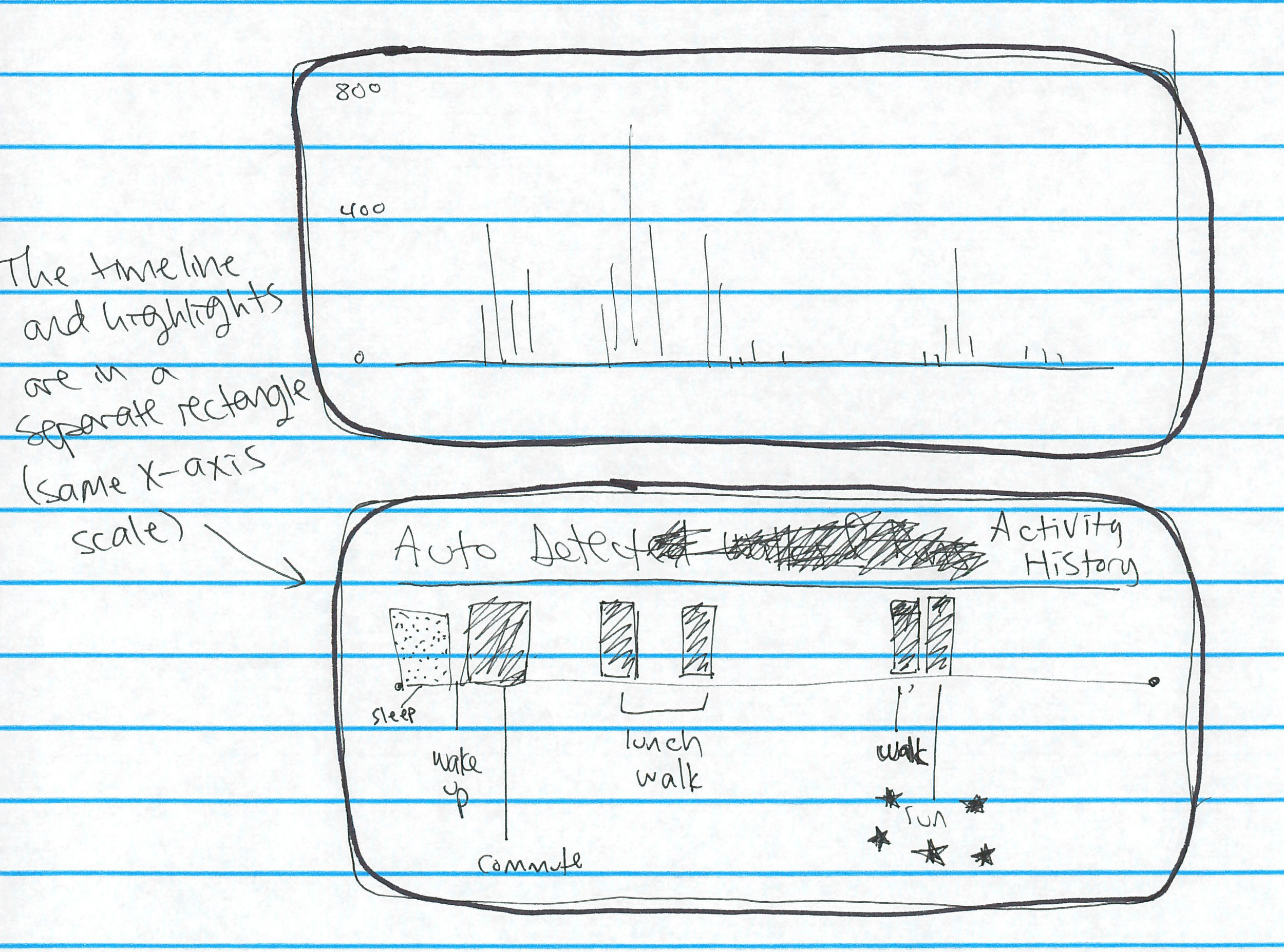


Blind spots in the algorithm, and how I designed around them
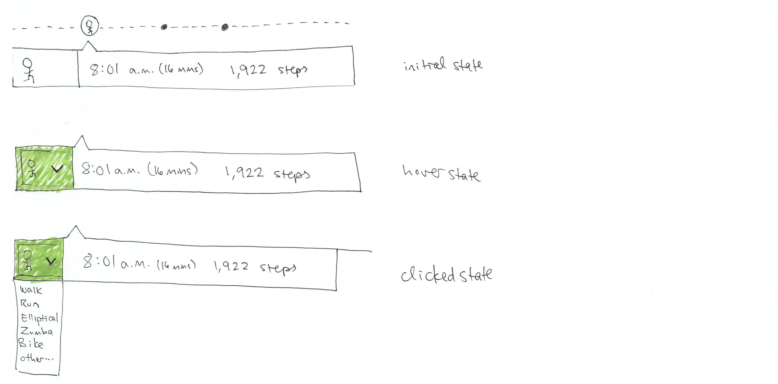
I kept running into a problem where users complained that the algorithm treated their bike rides, elliptical sessions, and aerobics workouts as either a walk or a run. In order to let users correct the algorithm when it makes this kind of mistake, I tested a second digital prototype allowing users to tag auto-detected activities with a single click:
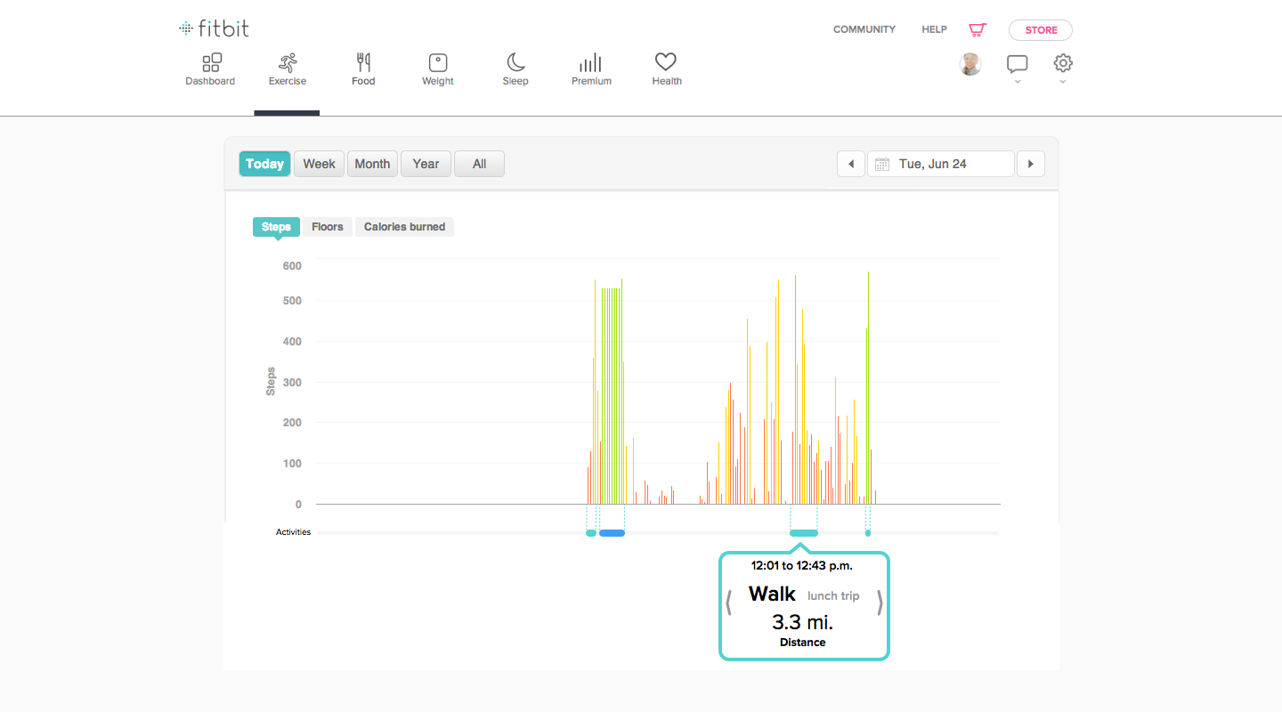
A screenshot of our digital prototype, with one Fitbit employee's actual data piped in.
We discovered that the "walk," "run," and "other" buttons didn't land with our participants at all! The flat buttons with the algorithm's estimation as the default selection didn't make the tag appear editable. We decided to throw out this interaction pattern completely.
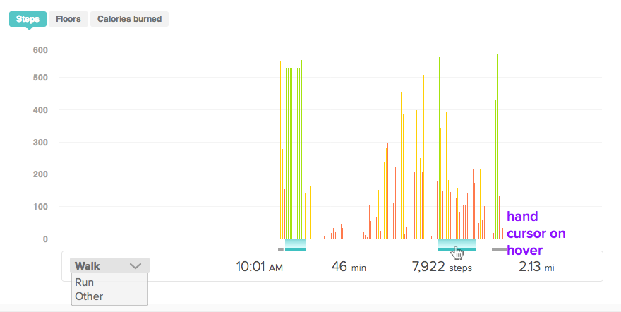
Therefore, I came to the decision that for now, the feature should designate all auto-detections as (editable) generic activities. In time, as users (somewhat laboriously) tag the activities in a different way, or as more sensitive Fitbit devices are released, machine learning could more accurately tag the activities. At the time, in 2014, my colleagues and I worried that mistaken tags would make users think that the Fitbit doesn't work well. Our earlier interviews did show that not too many people would tag an activity more than once; however, we felt that the risks in erroneously auto-tagging activities outweighed this drawback.
The final prototype
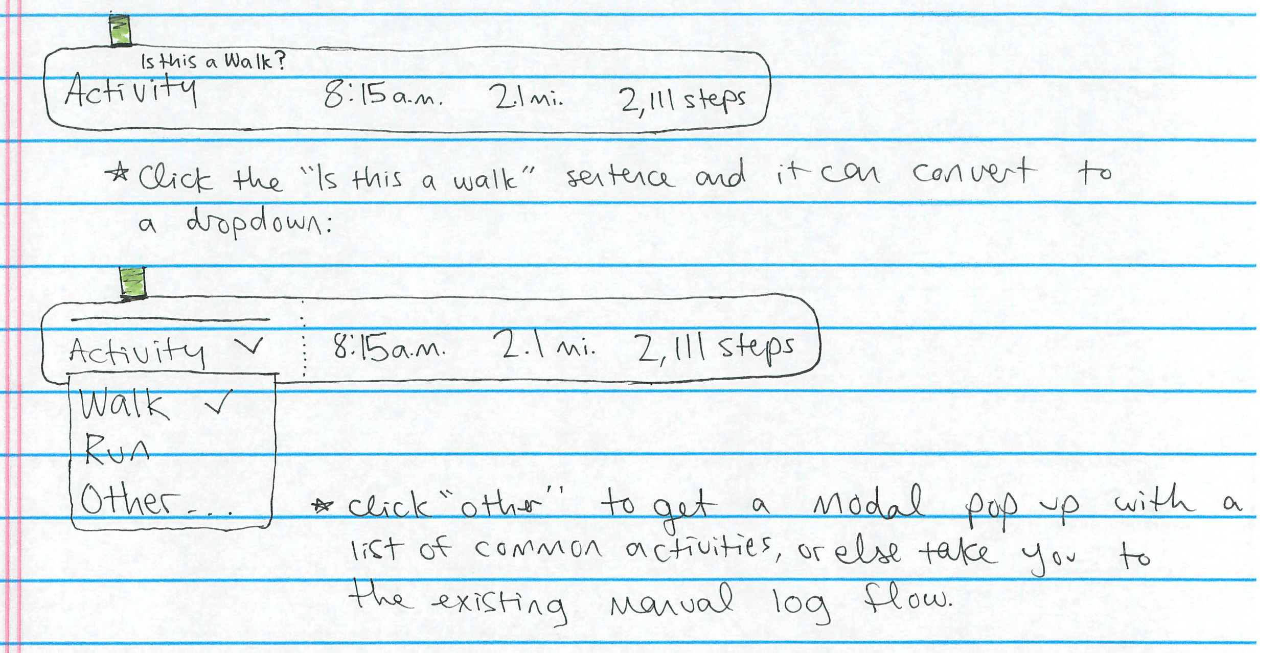
A visual design exploration on top of the digital prototype. The auto-detection box defaults to blank, and using the drop-down menu, the user can correctly tag the activity, if they want to.
During my last week at Fitbit, in August 2014, the prototype was released live on the dashboards of all users whose accounts had @fitbit.com email addresses.
Data was collected from the more than 300 users who had access to the production prototype, after I returned to Carnegie Mellon for the fall semester. The design and R&D teams continued to work on the feature, ultimately releasing it in 2015.